
readme.md 9.5 KB
next-xcascader适用于uni-app项目的多级选择组件
本组件目前兼容微信小程序、H5、APP端
本组件支持省市区选择、多级选择、自定义选择级数据自定义选择项、无限级联、通过接口异步加载选择项
本组件可以轻松结合第三方ui组件使用,已经实现双向绑定,同时支持vue3 vue2语法
从uniapp插件市场导入 遇到问题或有建议可以加入QQ群(455948571)反馈
如果觉得组件不错,给五星鼓励鼓励咯!
注意
作者不介意你对组件源码进行改造使用,为了开源更加高效,谢谢你的配合;为了节省不必要的沟通浪费,以下情况请不要再反馈给作者,请自行解决;
在这感各位的理解,我支持开源,但是作者时间有限;谢谢各位的配合;在这里期望我写的小小插件能为你提供便捷;
1.如果你对源码进行了修改使用,请不需要对作者做任何的反馈,作者确实没有空陪你做技术分析解答;
2.如果你引入插件,连插件是否有正常被uniapp框架识别解析都不清楚,请你换个插件使用;
3.如果你引入插件,针对自己项目进行功能改造的,请自行仔细阅读源码并了解其原理,自行改造;这里作者不愿意浪费过多时间进行技术解答;
4.理论上作者不再解决由于本地开发环境问题所导致的插件使用问题,请自行到uniapp官网学习解决;
使用方式(vue3 + uview-plus demo)
vue2同样适用,在这里不再写demo,如果有使用问题请加QQ群(455948571)反馈
<template>
<view>
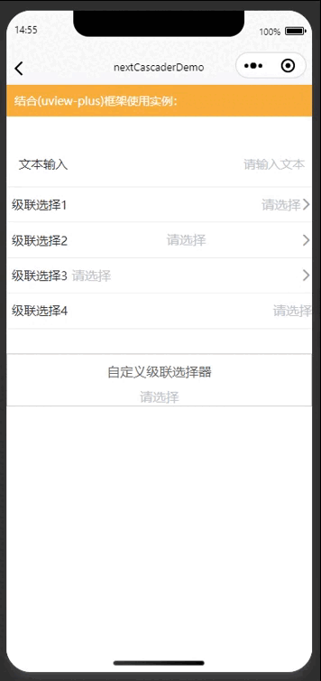
<view style="font-size: 14px;color:#fff;background-color: #f9ae3d;padding: 20rpx;margin-bottom: 30px;">
<text>结合(uview-plus)框架使用实例:</text>
</view>
<u--form labelWidth="80" labelAlign="right">
<u-form-item borderBottom label="文本输入">
<u-input input-align="right" placeholder="请输入文本" v-model="form.text" />
</u-form-item>
<u-form-item borderBottom label="级联选择1">
<next-xcascader inputAlign="right" placeholder="请选择" v-model="form.cascader" :options="options" />
</u-form-item>
<u-form-item borderBottom label="级联选择2">
<next-xcascader inputAlign="center" placeholder="请选择" v-model="form.cascader" :options="options" />
</u-form-item>
<u-form-item borderBottom label="级联选择3">
<next-xcascader inputAlign="left" placeholder="请选择" v-model="form.cascader" :options="options" />
</u-form-item>
<u-form-item borderBottom label="级联选择4">
<next-xcascader :showArrow="false" inputAlign="right" placeholder="请选择" v-model="form.cascader" :options="options" />
</u-form-item>
</u--form>
</view>
<view style="padding:0 20px;border:1rpx solid #ccc;margin-top: 30px;">
<view style="font-size: 16px;color: #666;padding: 10px;text-align: center;"><text>自定义级联选择器</text></view>
<next-xcascader :customRenderLabelFunc="customLabelRender" :showArrow="false" inputAlign="center" v-model:value="valueModel" @confirm="onconfirm" :options="options"></next-xcascader>
</view>
</template>
##options数据格式(city.js)(注意:组件自动检查数据源options的子集关键key,有多少层的子集关键key存在,就是多少级级联):
export default [
	{
	  value: '110000',
	  label: '北京市',
	  children: [
	    {
	      value: '110100',
	      label: '北京市',
	      children: [
	        {
	          value: '110101',
	          label: '东城区',
						children: [
							{
								value: '11010101',
								label: '东城区-测试1',
							},
							{
								value: '11010102',
								label: '东城区-测试2',
							}
						],
	        },
	        {
	          value: '110102',
	          label: '西城区',
	        },
	        {
	          value: '110105',
	          label: '朝阳区',
	        },
	        {
	          value: '110106',
	          label: '丰台区',
	        },
	        {
	          value: '110107',
	          label: '石景山区',
	        },
	        {
	          value: '110108',
	          label: '海淀区',
	        },
	        {
	          value: '110109',
	          label: '门头沟区',
	        },
	        {
	          value: '110111',
	          label: '房山区',
	        },
	        {
	          value: '110112',
	          label: '通州区',
	        },
	        {
	          value: '110113',
	          label: '顺义区',
	        },
	        {
	          value: '110114',
	          label: '昌平区',
	        },
	        {
	          value: '110115',
	          label: '大兴区',
	        },
	        {
	          value: '110116',
	          label: '怀柔区',
	        },
	        {
	          value: '110117',
	          label: '平谷区',
	        },
	        {
	          value: '110118',
	          label: '密云区',
	        },
	        {
	          value: '110119',
	          label: '延庆区',
	        },
	      ],
	    },
	  ],
	},
	{
	  value: '120000',
	  label: '天津市',
	  children: [
	    {
	      value: '120100',
	      label: '天津市',
	      children: [
	        {
	          value: '120101',
	          label: '和平区',
	        },
	        {
	          value: '120102',
	          label: '河东区',
	        },
	        {
	          value: '120103',
	          label: '河西区',
	        },
	        {
	          value: '120104',
	          label: '南开区',
	        },
	        {
	          value: '120105',
	          label: '河北区',
	        },
	        {
	          value: '120106',
	          label: '红桥区',
	        },
	        {
	          value: '120110',
	          label: '东丽区',
	        },
	        {
	          value: '120111',
	          label: '西青区',
	        },
	        {
	          value: '120112',
	          label: '津南区',
	        },
	        {
	          value: '120113',
	          label: '北辰区',
	        },
	        {
	          value: '120114',
	          label: '武清区',
	        },
	        {
	          value: '120115',
	          label: '宝坻区',
	        },
	        {
	          value: '120116',
	          label: '滨海新区',
	        },
	        {
	          value: '120117',
	          label: '宁河区',
	        },
	        {
	          value: '120118',
	          label: '静海区',
	        },
	        {
	          value: '120119',
	          label: '蓟州区',
	        },
	      ],
	    },
	  ],
	},
]
<script setup lang="ts">
import {ref} from 'vue'
import data from './city.js'

const form = ref({
	text: '',
	cascader1: '',
	cascader2: '',
	cascader3: '',
	cascader4: ''
})
const options = ref(data)
const valueModel = ref('')
function onconfirm(res) {
	console.log('---------confirm----------', res)
	console.log('--------v-model-----------', valueModel.value)
}
function customLabelRender(label) {
	return label ? ('自定义:' + label) : label
}
</script>
属性说明
| 名称 | 类型 | 默认值 | 描述 |
|---|---|---|---|
| value | String | '' | v-model(vue2) / v-model:value(vue3) 绑定值 |
| isMask | Boolean | true | 是否点击阴影关闭 |
| animation | Boolean | true | 是否开启动画 |
| safeArea | Boolean | true | 是否开启安全条 |
| options | Array | [] | 数据源 (详细请看city.jsdemo) |
| valueKey | String | 'value' | 数据源 中绑定value属性的关键key(用于做选中值的绑定) |
| labelKey | String | 'label' | 数据源 中绑定label属性的关键key(用于做选中值的显示) |
| childrenKey | String | 'children' | 数据源 绑定子集关键key |
| showArrow | Boolean | true | 是否展示右侧箭头 |
| placeholder | String | '请选择' | placeholder |
| disabled | Boolean | false | disabled是否禁用 |
| inputAlign | String | 'right' | 对齐方式 |
| customRenderLabelFunc | Function | 自定义显示label渲染函数,返回要显示的内容 |
Event 事件
| 事件名 | 说明 | 类型 | 回调参数 |
|---|---|---|---|
| confirm | 点击确定的回调事件 | emit | [Object] |
| close | 关闭控件的回调事件 | emit | --- |
预览
| (next-xcascader演示效果展示) |
|---|
 |